As Leonardo da Vinci said, « Simplicity is the ultimate sophistication« .
In most collaborative products, the home page is some kind of mashup which mixes different types of data. For example, we often find a thread with the last events (activity stream), the next actions to do (assigned to me), your favorite data, the most popular data, and so on…
If this strategy can be efficient for advanced users – who really likes to customize their home page -, we found out that most users get lost with so many informations displayed at the same time.
Where to look? Where to start? That’s really a common problem.
With The-Data-Box, a user can have multiple applications, and each application can contain a ton of heterogeneous and interesting informations. In this context, solving the equation of what to display and where was just impossible : some users prefered this here and that there, and nobody could really agree on what was necessary and what was not!
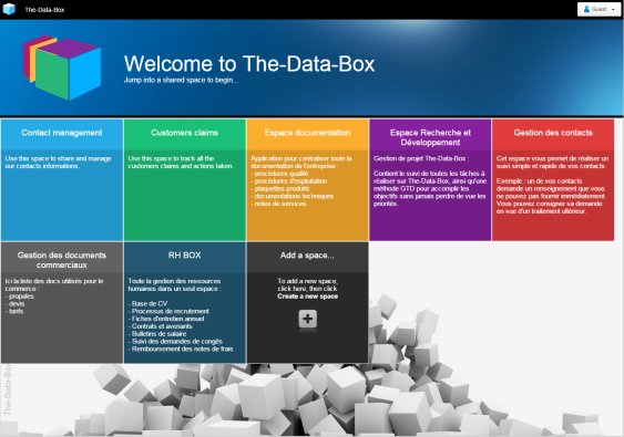
After a lot of internal testing, we ended up with the simplest possible solution : we display nothing by default! There is two possible entry points.
At the highest level, we have the user’s account home page. We call it : the Welcome page. Here, we just display the list of available applications, where each application is a clear, easy-to-click, flat and colored square. For the user, there is no possible mistake!
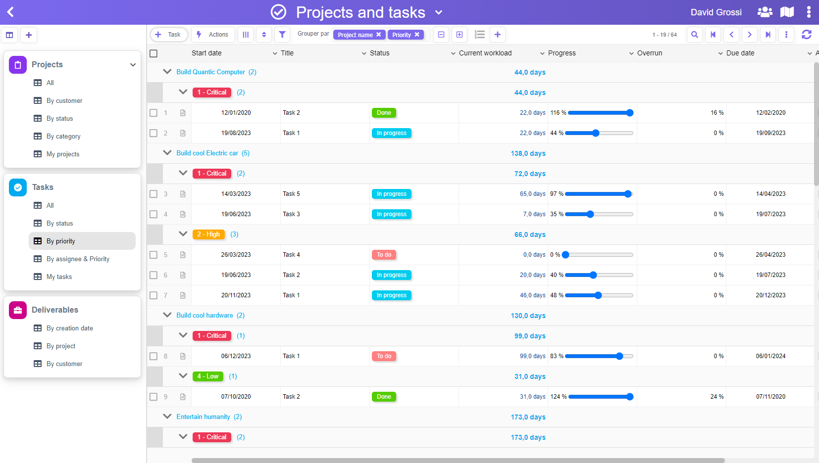
This leads to the application’s home page. Here again, we have decided to not loose our user, who can only click in the left navigation pane, where he will find all the entries he needs (things I have to do, most recent data, data received by emails… or specific filters) :
Of course, each application can be bookmarked in order to avoid the « Welcome page ». Reaching the right information is then a one click process, and there is never any « noise » in the user’s perception.
Can we do something simpler? We really don’t think so…
In the sample below, we have clicked on a customized filter :
Honestly, we have built and rebuilt the user interface many times before reaching this apparent simplicity, and there has been a lot of work to reach that level. The funny thing is that, in the end, we just wonder why we could not start with this one!


