That’s it! 2018 is here, and we’re happy to announce that a major version of PickaForm has just been released to celebrate this new year!
For this version, we kept 100% of the focus on the user experience, and each evolution was based on the feedback of our fellow users.
So, what has changed for our low-code platform?
1. We’ve abandonned the “accordion” of the left navigation pane, which was divided it into 4 sections (forms, lists, tags & dashboard).
It was a difficult decision because those 4 basic components were some of our primary concepts when we conceived PickaForm.
Nevertheless, we realized 2 things afterwards:
- existing users really liked it once they got the concepts of “forms & lists”
- BUT… newcomers didn’t understand it immediately, and this was a bad thing because the first impression is very important when you explore a new application.
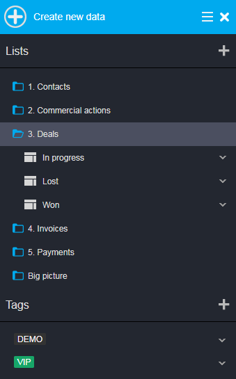
Instead of the accordion that lived here for nearly 3 years, we have:
- replaced the “forms” section by a single “Create new data” button, easier to understand
- merged all the various “lists” into a single tree of folders
- kept a “tags” section always opened
We have also created 2 color themes: “dark” and “light“. Here is the result:


The main advantage is that everything is in sight: we can understand immediately what we can do with an application without having to “explore” the navigation bar.
2. For the administrators, we have integrated “back-office” features to the left navigation pane.
This way, they don’t have to navigate back and forth to setup an application. We have also added a menu that gives a direct access to every configurations:

3. We have totally reworked the look&feel of the forms, with a major move: buttons (Edit, Save, Exit, …) are not anymore docked in the left pane, but lies at the top.
This leaves the left navigation pane for the form features only, which clarifies things and allowed us to add the button “Edit form features“:

You maybe noticed we also have moved the document tags to the top right (here, “DEMO”).
4. Modifying a list is now more straightforward
The design toolbar allows to:
- Edit the list properties (name, folder, access rights)
- Add a column (or move & edit by clicking on their header)
- Filter data using a small wizard that helps you to build your request

We have also introduced a new menu to edit / delete / duplicate each list directly from the navigation pane:

5. The back-office to setup an application also received a good facelift and was simplified at its maximum:

As you can see, there was a fair number of evolutions that should ease the life for both the end-users and the administrators.
We really hope you will like this new user interface, and we are confident that it will make PickaForm one of the best low-code platform in 2018!
Also, don’t forget you can send us some feedback anytime you want at support@pickaform.com.
Happy New Year!


