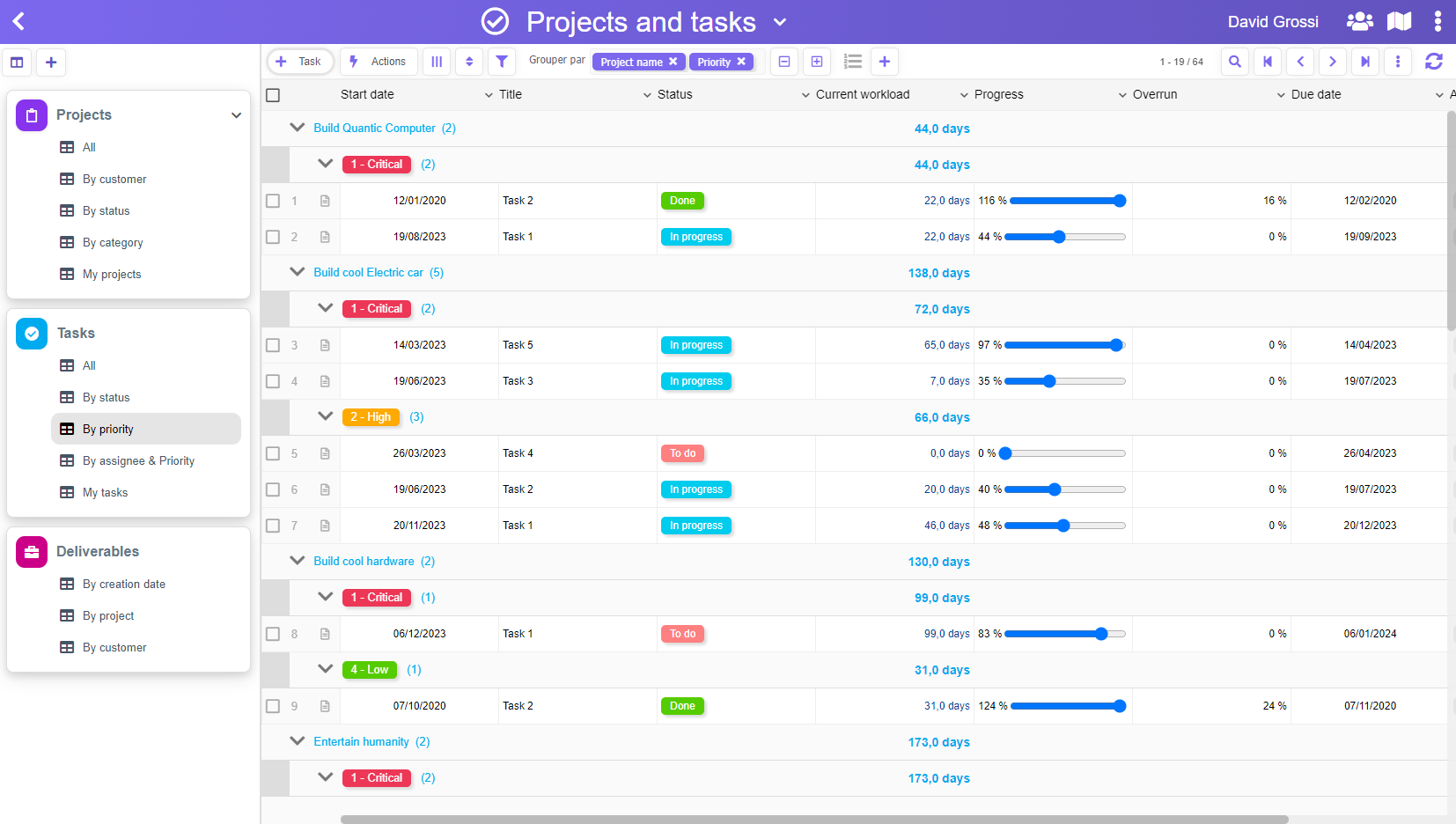
The new release 433 has just been released with a fair number of evolutions, but we will highlight two ergonomy improvements in this post.
First, some customers are using the lists extensively to organize their informations, which result is a long menu in the left navigation bar.
For those who wants to see more lists at a glance, we have integrated a “Compact” display option in the list context menu (right-click) :

The other evolution is into the forms. When a form had the feature “Links” activated, it was displaying a unique “Links” menu in the left bar.
Now, if a form is connected to many other forms (example: a Case connected to Provisions and Invoices), it will display as many menu entries as connected forms.
This allows a 1-click access to each type of connected form (against 2 clicks before), and it also allowed us to integrate the creation buttons directly in the left navigation bar.
Simpler, clearer!


