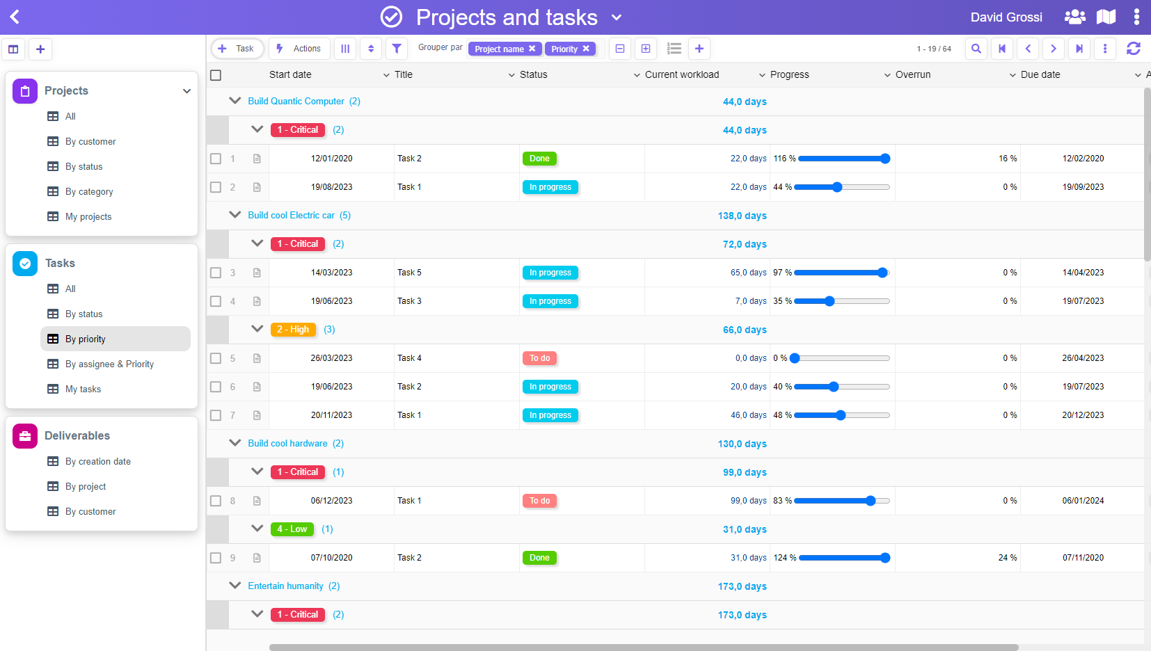
Today, we’ve just introduced some UI improvements.
First, we wanted to have our product working on “small” screen resolutions, and despite all the informations we have to display, we managed to make a smooth experience with the most used screen resolution, which is currently 1366×768 (have a look here if you want some details). To make it work perfectly, we also removed extra pixels for the Windows task bar (which is usually at the bottom or on the side).
Secondly, because our product allows to do so many things, we wanted to define a clearer path for the user who would like to setup an application. This is now done! When a new user is onboarding, he’s guided to achieve is first app in minutes, just following the arrows…
Last but not least, we have finalized a fully in-app help that give every details about every procedures, for an in-depth dive into the product!
We hope you’ll like it.
Welcome screen

Empty application landing page

Empty application settings


