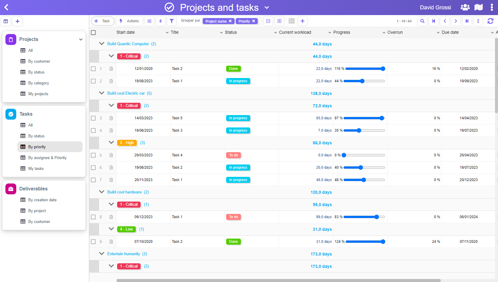
Since we wrote about our choice to NOT have a graph editor for our workflows, we had some interesting discussions about it with « graph defenders » – mostly BPMN professionals.
Let’s make it clear, we love BPMN for what it’s very good at: covering every possible use cases of every imaginable workflows. We have worked with BPMN tools for many years (mostly Bonita, IBM Workflows, and sometimes BizAgi for the design part).
With The-Data-Box, our purpose is to cover only common and simple cases. Our tool is really dedicated to people who has no clue about BPMN, and who would probably draw something on a blank page – with pen and paper – to design their flow.
This drawing step is usually necessary during the design process, and our assertion is that, for a simple workflow, it’s not useful to do this design part within a graph editor, which has a lot of constraints, and requires some training. For a simple flow, nothing can beat the pen & paper.
Now, let’s compare the amount of work required to build a simple Task Management graph, and it’s equivalent within The-Data-Box.
Here is what our graph should look like (made with YEd graph editor) :
Honestly, with so many arrows, we had to rearrange things many times to get things readable. Now, it’s quite OK, but is it really « clean », and was it worth the effort?
Now, let’s see the same thing within The-Data-Box :
It’s pretty clear what decisions you can make at each step, and we didn’t have the extra work to arrange rectangles and arrows properly to make it readable.
Just give it a try, and we’re sure you’ll be convinced.


